The Best and Worst Olympic Logos Of All Time
I have always been a big fan of the Olympic games and as a designer who has created so many logos for customers around the world, there was no doubt that I always found Olympic logos very interesting. In this article I would like to share my thoughts on the evolution of the Olympic logos and rate my most and least favourite logos of all time.
Let me tell you in advance that I haven’t read anything about the design process of these logos and apart from a few exceptions, I don’t know much about how they were presented by the designers or how they were approved by the committees. As a designer with 14 years of professional experience, I can tell you that designers will always have fancy words to defend their design and the “deep” meaning behind it. I am not here to discuss what they wanted to achieve or what the secret message behind that design is. All I want to talk about is the execution.
If a design is easy on the eyes and if it works without the commentary from the designer, then it is well executed. Speaking of execution, I am going to start with the logos I am not very fond of. Here are the logos which I think are the worst Olympic logos ever:
I am leaving out any logos designed before 1960, because most Olympic logos before that date either look like a poster or are just too dated that If I include them, they will fill up the worst logos section very quicky.
Mexico 1968 Summer Olympics
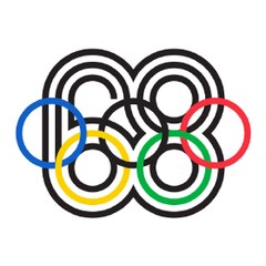
This is a very good idea but a weak execution. The design is a bit too messy and way too complicated than it should be. The problem could have probably been solved by using a different color for 68 as it’s mixing up with the black Olympic ring.
Munich 1972 Summer Olympics

As far as I can see this symbol has got nothing to do with Munich and it certainly has got nothing to do with the Olympic Games. So what’s the point unless the designer was a fan of the Hitchcock movie “Vertigo”.
London 2012 Summer Olympics
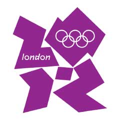
This logo is a marketing miracle. That’s a fact. These guys know how to sell a logo, so hats off to them. Every designer or “designer wannabe” must learn a page or two from their book. In reality, it’s nothing special. I have to admit though: it is memorable! But for all the wrong reasons!
Turin 2006 Winter Olympics
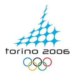
I know this is supposed to be a very abstract representation of a famous Turin landmark. But without that information, it just looks like the most pointless abstract shape ever. When I look at it, I can say it looks like an abstract pine tree with snow on it. That would actually make more sense as it was designed for winter games.
Calgary 1988 Winter Olympics
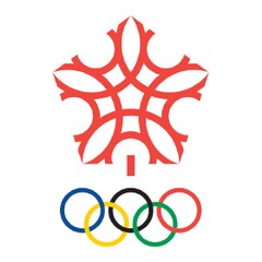
If this is supposed to be an abstract snowflake, then it looks nothing like it. I am assuming it’s a snowflake, because the logo is made for Winter Olympics. Or, since the games were in Canada, this could have been an abstract maple leaf. But again it is too abstract, feels like they have forced it a bit.
…and with that, I wrapped up my least favourite Olympic logos.
Before I get into my favourite Olympic logos, there is one logo I can’t decide whether I like it or not. It is the logo of Lillehammer 1994 Winter Olympics.
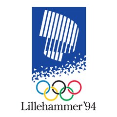
I like and hate this logo for the same reason. I like it because it reminds me of 2 logos I really liked in the 1990s. Those logos belonged to Sierra Entertainment (a Software company) and Televisa (a Mexican media company).

And I hate it for the same reason: Because it reminds me of software and media companies. I had to look it up and the abstract striped shape on the Lillehammer logo is supposed to represent the “Northern Lights” in Norway. It’s a good advert for that natural phenomenon I guess.
Best Olympic Logos Ever (in my opinion)
(In no particular order apart from an obvious winner. Keep reading!)
Sydney 2000 Summer Olympics
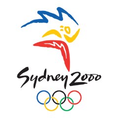
This logo does a better job of what Barcelona 1992 logo pioneered. Let’s be fair, the logo of the 1992 summer games actually put a focus on the athletes with that colorful abstract shape. Sydney 2000 logo repeated that but that was just part of the story. From boomerangs, to a torch-carrying athlete, and to the references to Sydney opera house, this logo screams Australia. Typeface is a perfect match for the style of the icon. This is a great logo.
Athens 2004 Summer Olympics
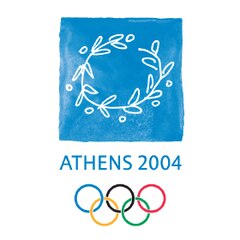
In 2004, OIympic games returned to their ancient home: Athens, Greece… and this logo was a perfect celebration! I can’t think of any other symbol that can represent Greece and Olympic Games better than a simple olive wreath.
Atlanta 1996 Summer Olympics
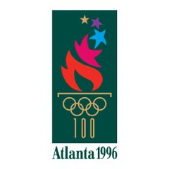
Marking the 100th year of the modern Olympic games, Atlanta 1996 logo had everything going for it. There is nothing to dislike here. It’s got an Olympic torch, Olympic fire and stars representing the very talented athletes from all over the world. Olympic rings are a given. As a viewer of the games, I expect the logo to reflect the spirit of the Olympics. This one does a very good job.
Nagano 1998 Winter Olympics
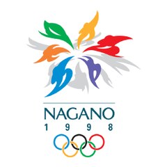
This by far is the best use of a snowflake in a logo for Winter Olympics. It also looks like a colorful flower, with each petal representing an athlete who competes in a winter sport. Finally, it doesn’t hurt that it looks this good!
Beijing 2022 Winter Olympics
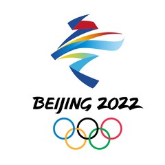
This logo made for the upcoming Winter Olympics is a masterpiece. I love every aspect of it. The abstract shape with ribbons depicts two of the most popular sports of Winter Olympics. Upper half of the shape is a skater, while the lower half is a skier. Not only does it reflect the spirit of the winter games extremely well with its colors and flawless execution, it is just beautiful to look at. For me as a designer, this is the best Olympic logo ever, and none other comes even close.


